Wednesday, March 23, 2011

Hypsometric Mapping

Hypsometric mapping uses color to show the difference in elevation of a geographical area.

This map shows the different elevations of the Goiania Metropolitan Region.

http://www.earthexplorer.com/2009-03/Subsurface_Geology_Challenges_Goiania_Metro.asp

Proportional Circle Map

A proportional circle map applies a formula to control the area of circles, the circles' areas' reflects some attribute value of the area.
This map shows the Filipino population of certain Southern states.

http://www.neiu.edu/~ejhowens/377/examples.htm

Box Plot

A box plot (also known as a box and whisker diagram) displays the data using the 5-number summaries: the minimum, the lower quartile, the median, the upper quartile and the largest observation.

This box plot shows the annual snow depth at a Ski Resort.
http://staffweb.mps.k12.mi.us/MurphyLL/Resources.html

Mental Maps

Mental Maps are maps made by people in their heads, displaying each person's point of view.

This is a map of someones neighborhood, drawn the way that they see it.
http://www.fedstats.gov/kids/mapstats/concepts_mentalmaps.html

Infrared Aerial Photo

Infrared aerial photos are aerial photos, where the film is sensitive to infrared wavelengths, instead of to the visible spectrum.


This infrared aerial photo shows the channel and levees in the San Joaquin river delta.
http://www.aerialarchives.com/Infrared-Aerial-Photography.htm

Unclassed Choropleth Map

In an unclassed choropleth map, the number of categories is equal to the number of data values.

This unclassed map shows the fertility rate attribute values for countries in Europe.
http://www.esds.ac.uk/international/support/user_guides/gisoverview.asp

DOQQ

DOQQ stands for Digital Orthophoto Quarter Quad. They are aerial photos that have differing shades of red.

This is an image of a hill side.
http://www.geomart.com/images/digital/doqq/doqqhillside.jpg

Bivariate Choropleth Map

A bivariate choropleth map is a variation of a simple choropleth map. It displays the relationship between 2 spatially distributed variables on the same map.

This map shows the landslide susceptibility map for the active landslides types on the North facing slope. The different colors show the different susceptibility levels.
http://eost.u-strasbg.fr/omiv/barcelo_area_landslide_hazard.html

Cadastral Map

A cadastral map shows the property line within a county. Commonly includes ownership and GPS locations of each parcel of land.

http://www.oxfordjctgenealogy.com/main/?page_id=244
This is a cadastral map from 1908 of Dzbanov.

Climograph

Climographs are a representation of the relation between temperature and precipitation. The data is plotted at monthly intervals throughout the year.

This climograph shows the precipitation and temperature of Valentina, Ireland.
http://www.google.com/imgres?http://www.uwsp.edu/geo/faculty/lemke/geog101/lectures/09_global_climate_patterns.html

Parallel Coordinate Plot

Parallel coordinate maps plot data elements as connected sets of points, one on each axis. They are used to analyze multivariate data.

This 3D parallel coordinate map shows the ratio of genes to cells. Each line represents a different variable and continues through the entire graph.
http://www-vis.lbl.gov/Events/SC07/Drosophila/3DParallelCoordinates.png

PLSS

A public land system survey is a method used to survey land parcels in the US. It shows boundaries on maps.

This survey shows tax ownership, major roads and highways of the area.
http://www.kitsapgov.com/gis/maplibrary/

Correlation Matrix

A correlation matrix is a matrix whose entries are correlated with each other.

This is a correlation matrix of Phage T7 Proteins.
http://yin.che.wisc.edu/images.htm

Isohyet

Isohyet maps show the rainfall of an area. Isohyets are contour lines that connect the same amount of rainfall with each other.

This map shows the rainfall of andhra Pradesh, a region in India.
http://www.fao.org/docrep/009/a0415e/A0415E11.htm

Starplot

A starplot (also known as a radar chart) allows you to compare multiple variables for each observation. Its an easy visualization of many variables.

This star plot shows different results showing multiple variables of new designs for a NASA imaging system.
http://start1.jpl.nasa.gov/caseStudies/autoTool.cfm

Stem and Leaf Plot

Stem and Leaf plots provide a simple graphical summary of a set of data. The show the median of the data set as well as the average and the measure of dispersion.
They are especially useful when comparing 2 or more sets of data.

This stem and leaf plot shows the infant mortality rate in Western Africa.
http://mainland.cctt.org/mathsummer/JosephBond/StemAndPlots/stem-and-leaf_std.htm

Histogram

Histograms display tabulated frequency. They show a distribution of data, which has been separated into classes.

This histogram shows the distribution of salaries at Megamart.
http://www.edbergphoto.com/pages/Tip-DigitalHistograms.html

Similarity Matrix

Using a scale of colors, a similarity matrix shows how similar different variables are on a scale from 0 to 1.

This similarity matrix shows the similarity between signatures of different strains of diseases.
http://www.biomedcentral.com/1471-2164/8/353/figure/F5?highres=y

Index Value Plot

Index value plots plot the index value on a line graph, as opposed to the absolute number in a data set.

This index plot has plotted the index value of the flow stream of water from 2001-2008.
http://waterwatch.usgs.gov/new/?m=pa07d&w=plot

Lorenz Curve

A Lorenz Curve (also known as an Accumulation Plot) shows actual distribution of the data vs. the equal distribution of the data.

This graph shows the distribution of incomes, and the curve shows the difference between the actual distribution and the equal distribution of incomes.
http://en.wikipedia.org/wiki/File:Economics_Gini_coefficient2.svg

Isotach

Isotachs show the wind speed of an area, using contour lines to join together the same speed.

This particular isotach is showing the wind speed around New York.
http://www.erh.noaa.gov/btv/events/28Oct2008/ua2.php

Monday, March 21, 2011

Bilateral Graphs

Bilateral graphs are graphs that show 2 related variables.

This graph shows the speeds of boats and rowers relative to the common center of gravity.
http://www.rowperfect.com.au/innovative_training.html

Isobar

Isobars are lines that connect the same air pressures of an area.

This map shows the isobars closing, creating a low pressure cell around an area.
http://www.newmediastudio.org/DataDiscovery/Hurr_ED_Center/Hurr_Structure_Energetics/Closed_Isobars/Closed_Isobars.html

Choropleth Maps

Choropleth Maps are the most common type of quantitative thematic maps. It maps the standardized data for a certain variable pertaining to the geographical location.

This map shows the standardized mortality ratio data by county of mortality rates due to cervical cancer. It has been filtered to show where the high risk clusters of the disease are located. (The brighter areas.)
http://www.geovista.psu.edu/grants/nci-esda/research.html

Scatter Plot

Scatter Plots show the relationship between 2 variables in a set of data. Each data point has 2 variables, which are represented on the X and the Y axis of the graph.

This scatter plot shows the height of Olympic gold medal winning high jump from the years 1900-1980.
http://staff.argyll.epsb.ca/jreed/math9/strand4/4102.htm

Cartogram

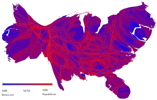
A cartogram is a map in which a thematic variable replaces land area or distance. This often distorts the area or size of the map. The variable can be anything like income, population, gross national product, etc.

http://en.wikipedia.org/wiki/File:Cartlinearlarge.png
This cartogram has the counties of the country rescaled to depict population, and it also shows the popular vote during the 2004 elections.

Triangular Plot

A triangular plot graphs 3 different variables. It is often used to show the composition of soils and rocks in geology.

This specific triangle displays the components and amount of substances for different soil types.
http://vielmetti.typepad.com/

Wind Rose

A windrose is used by meteorologists to show wind speed and direction of a specific geographical location.

This is a windrose showing the wind speed and direction for La Guardia Airport in New York City.
http://en.wikipedia.org/wiki/File:Wind_rose_plot.jpg

Population Profile

A Population Profile is a chart that shows the number of people as a function of their ages. The data is separated into women and men of the population, and sometimes certain characteristics of a population are charted.

This population profile shows the number of women and men in the population who have HIV/AIDS, by color coding the data.
http://www.ifad.org/operations/regional/pf/aids_1.htm

Thematic Map

A thematic map is a map which shows a specific subject (population, cultural lifestyle, etc.) or phenomena (rainfall, etc.) connected with a geographic area.
This map shows the soil moisture regimes of the US. The country is color coded into areas that share the same soil moisture content.

http://soils.usda.gov/use/thematic/moist_regimes.html