Sunday, February 6, 2011

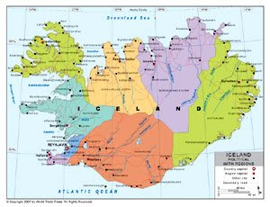
Planimetric maps show the horizontal positions of the features on the map, but do not present any information regarding the elevation of formations. They are also known as line maps.


http://www.bestcountryreports.com/Political_Map_Iceland_Provinces.html

This political map shows Iceland, but has no information about the density of the land. It only shows the size of the island and the shape of it. As well as other aspects about their political boundaries, which has nothing to do with planimetric maps.

Topographic Map

Topographic maps show the elevation of the area represented in the map. Normally this is accomplished with the use of contours, which are lines which connect points of equal elevation. Topographic maps capture the 3D aspect of a terrain on a flat surface, by being able to capture physical landforms of the earth's surface.

This topographic map of India does not use contour lines, and instead the different elevations of the surface are represented by different colors, with a key on the bottom left hand corner.
http://www.mapsofindia.com/maps/india/topographic-map.htm

Dot Distribution

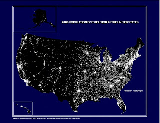
A dot distribution map is a thematic map in which dots are used to describe a specific quantity of a given variable.

This map from the US Census Bureau shows population density in the US. The more dots in an area, the more populated it is.

http://www.census.gov/geo/www/mapGallery/2kpopden.html

Tuesday, February 1, 2011

Doppler Radar

Doppler radars are used a lot for weather measurements. Doppler radar maps show a shift in frequency in the waves produced by something moving.

This specific dopple radar map shows a hurricane on the move. The closer to the center of the green mass, the more rainfall there will be in that area. These maps are usually shown with many images following each other, and you can see the actual hurricane moving.
http://www.buzzle.com/articles/doppler-effect-how-doppler-radar-works.html

Flow Maps

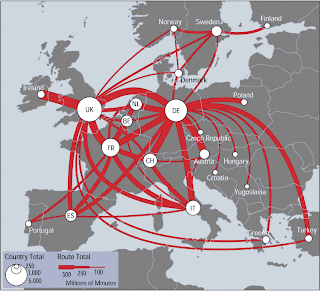
Flow maps are used to show the movement of something from one place to another. This can be anything like water, goods, people, etc.


http://www.mundi.net/maps/maps_014/
This map shows telephone traffic between the depicted countries. The thickness of each line is proportional to the yearly volume of traffic.
This is a map because it shows the relationship between the countries, and specifically the network of communication between the countries shown.