Sunday, April 24, 2011

Dasymetric Mapping

Dasymetric Mapping is a form of thematic mapping mainly used when graphing data that portrays volume. It uses symbols or color shading to portray the different volumes.

This map shows the population density of the San Francisco Bay Area.
http://geography.wr.usgs.gov/science/dasymetric/

Continuously Variable Proportional Circle Map

These are a type of choropleth map. They are proportional circle maps which use circles to create point data on maps. The circle sizes are proportional to the variable being measured.

This map shows the number of vehicle related deaths in the state. The bigger the circles- the higher the number of deaths.
https://www.e-education.psu.edu/geog486/l5_p5.html

Orienteering Map

Orienteering maps are maps made specifically for competitions. They are very detailed maps of the area where the competition will take place and point out things in the area that will be important for the competition.

This map shows an area in Northern Denmark with a competition route going through it, and what other physical features competitors can expect to find.
http://en.wikipedia.org/wiki/File:Orienteringskort_bygholm_2005.PNG

DLG

Digital Line Graphs are digital maps that are distributed by the US Geological Survey. They are collected from the USGS maps and are distributed within 9 different categories of physical features.

This map shows contours, roads and lakes using different sets of data acquired from the USGS.
http://web.wt.net/daba/dlg/default.html

Nominal Choropleth Maps

Nominal choropleth maps are used to show nominal values for certain geographical areas. The different colors represent different values, and the values are all classed.
This map shows the accessibility to drinkable water for a state.

http://geoportal.icimod.org/TrainingandEducation/GISforBeginners/p1ch8/

Unstandardized Choropleth Maps

Unstandardized choropleth maps are unordered maps. The classes being mapped are not ranked in relation to each other.

This map shows the most prevalent minority living in each state.
https://courseware.e-education.psu.edu/courses/geog482/graphics/citationexample.jpg

World Aeronautical Chart

World Aeronautic Charts show topographic information, airports and radio navigational aids. They are used by pilots operating at high altitudes.

This is an aeronautic chart of North America.
http://www.flywestwind.com/wtc/charts.htm

LIDAR

Lidar mapping is a remote sensing tool which uses light pulses from a laser to create satellite images of a geographic area. Its often used in the military.

This is an image of the Florida Keys using Lidar satellite technology.
http://rst.gsfc.nasa.gov/Sect14/Sect14_12.html

DEM

Digital Elevation Maps use stored data about terrain elevation about the earth's surface to create digital models or maps showing the different elevations of an area.

The different shading in this map shows the different elevation of the terrain in the area. The viewer can see the different elevations that the trail goes through.
http://superstition-sar.org/maps.htm

Isopachs

Isopach maps are areal maps that show the thickness variation of the earths surface. They are often used in geology.
http://www.kgs.ku.edu/PRS/Coal/mineral.html

This map shows the different thickness levels of the types of coal in this area.

DRG map

A Digital Raster Graphic (DRG) is a scanned image of a USGS topographic map, and it includes all the map collar information.
They all are made to fit with the Universal Transverse Mercator projection. They are scanned at a minimum resolution of 250 dots per inch.

This is a scanned image showing the geographical location and surroundings of Michigan State University.
http://lter.msu.edu/maps/GIS/DRG_d.jpg

Isopleth Maps

Isopleth maps are used in geography and in meteorology. In geography, isopleths maps are used to generalize data with a continuous distribution.
In meteorology, isopleths is the term used for any type of contour line.

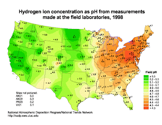
This isopleth map shows the different pH concentration levels across the US. The levels are dotted and the surrounding colors correlate to the different concentration levels.
http://dwb4.unl.edu/chem/chem869v/chem869vlinks/weather.about.com/newsissues/weather/library/weekly/aa071600a.htm

Statistical Map

Statistical maps are also known as distribution maps. They are graphic representations of any quantifiable data that someone has statistics for. This can be anything from how many events an area has to how many geographical features it has to how much rainfall an area gets, etc.


This map uses color to show the average different times that it takes people to drive to work from state to state. The statistic is displayed as a color.
http://mappery.com/map-of/United-States-Travel-Time-to-Work-Statistical-Map

Isoline

Isoline maps uses contour lines to show a common variable on a map. The contour lines can be connecting points of equal temperature (isotherms), pressure (isobars), etc.


This isoline map shows the annual runoff depth of China.
http://www.greenstone.org/greenstone3/nzdl%3Bjsessionid=5ECDCCE4E59E8E65286429EA47AC9289?a=d&d=HASH01815a5264fa0f4bfa328693.10&c=ccgi&sib=1&dt=&ec=&et=&p.a=b&p.s=ClassifierBrowse&p.sa=

Propaganda Maps

Propaganda Maps are used by people in power to show the control or exploitation of areas. Its often used politically to show national threats.


This map was used during WWII by the British to show the threat that Germany was posing as an expanding power, and showing how they planned on taking over the surrounding countries.