Sunday, April 24, 2011

Dasymetric Mapping

Dasymetric Mapping is a form of thematic mapping mainly used when graphing data that portrays volume. It uses symbols or color shading to portray the different volumes.

This map shows the population density of the San Francisco Bay Area.
http://geography.wr.usgs.gov/science/dasymetric/

Continuously Variable Proportional Circle Map

These are a type of choropleth map. They are proportional circle maps which use circles to create point data on maps. The circle sizes are proportional to the variable being measured.

This map shows the number of vehicle related deaths in the state. The bigger the circles- the higher the number of deaths.
https://www.e-education.psu.edu/geog486/l5_p5.html

Orienteering Map

Orienteering maps are maps made specifically for competitions. They are very detailed maps of the area where the competition will take place and point out things in the area that will be important for the competition.

This map shows an area in Northern Denmark with a competition route going through it, and what other physical features competitors can expect to find.
http://en.wikipedia.org/wiki/File:Orienteringskort_bygholm_2005.PNG

DLG

Digital Line Graphs are digital maps that are distributed by the US Geological Survey. They are collected from the USGS maps and are distributed within 9 different categories of physical features.

This map shows contours, roads and lakes using different sets of data acquired from the USGS.
http://web.wt.net/daba/dlg/default.html

Nominal Choropleth Maps

Nominal choropleth maps are used to show nominal values for certain geographical areas. The different colors represent different values, and the values are all classed.
This map shows the accessibility to drinkable water for a state.

http://geoportal.icimod.org/TrainingandEducation/GISforBeginners/p1ch8/

Unstandardized Choropleth Maps

Unstandardized choropleth maps are unordered maps. The classes being mapped are not ranked in relation to each other.

This map shows the most prevalent minority living in each state.
https://courseware.e-education.psu.edu/courses/geog482/graphics/citationexample.jpg

World Aeronautical Chart

World Aeronautic Charts show topographic information, airports and radio navigational aids. They are used by pilots operating at high altitudes.

This is an aeronautic chart of North America.
http://www.flywestwind.com/wtc/charts.htm

LIDAR

Lidar mapping is a remote sensing tool which uses light pulses from a laser to create satellite images of a geographic area. Its often used in the military.

This is an image of the Florida Keys using Lidar satellite technology.
http://rst.gsfc.nasa.gov/Sect14/Sect14_12.html

DEM

Digital Elevation Maps use stored data about terrain elevation about the earth's surface to create digital models or maps showing the different elevations of an area.

The different shading in this map shows the different elevation of the terrain in the area. The viewer can see the different elevations that the trail goes through.
http://superstition-sar.org/maps.htm

Isopachs

Isopach maps are areal maps that show the thickness variation of the earths surface. They are often used in geology.
http://www.kgs.ku.edu/PRS/Coal/mineral.html

This map shows the different thickness levels of the types of coal in this area.

DRG map

A Digital Raster Graphic (DRG) is a scanned image of a USGS topographic map, and it includes all the map collar information.
They all are made to fit with the Universal Transverse Mercator projection. They are scanned at a minimum resolution of 250 dots per inch.

This is a scanned image showing the geographical location and surroundings of Michigan State University.
http://lter.msu.edu/maps/GIS/DRG_d.jpg

Isopleth Maps

Isopleth maps are used in geography and in meteorology. In geography, isopleths maps are used to generalize data with a continuous distribution.
In meteorology, isopleths is the term used for any type of contour line.

This isopleth map shows the different pH concentration levels across the US. The levels are dotted and the surrounding colors correlate to the different concentration levels.
http://dwb4.unl.edu/chem/chem869v/chem869vlinks/weather.about.com/newsissues/weather/library/weekly/aa071600a.htm

Statistical Map

Statistical maps are also known as distribution maps. They are graphic representations of any quantifiable data that someone has statistics for. This can be anything from how many events an area has to how many geographical features it has to how much rainfall an area gets, etc.


This map uses color to show the average different times that it takes people to drive to work from state to state. The statistic is displayed as a color.
http://mappery.com/map-of/United-States-Travel-Time-to-Work-Statistical-Map

Isoline

Isoline maps uses contour lines to show a common variable on a map. The contour lines can be connecting points of equal temperature (isotherms), pressure (isobars), etc.


This isoline map shows the annual runoff depth of China.
http://www.greenstone.org/greenstone3/nzdl%3Bjsessionid=5ECDCCE4E59E8E65286429EA47AC9289?a=d&d=HASH01815a5264fa0f4bfa328693.10&c=ccgi&sib=1&dt=&ec=&et=&p.a=b&p.s=ClassifierBrowse&p.sa=

Propaganda Maps

Propaganda Maps are used by people in power to show the control or exploitation of areas. Its often used politically to show national threats.


This map was used during WWII by the British to show the threat that Germany was posing as an expanding power, and showing how they planned on taking over the surrounding countries.

Wednesday, March 23, 2011

Hypsometric Mapping

Hypsometric mapping uses color to show the difference in elevation of a geographical area.

This map shows the different elevations of the Goiania Metropolitan Region.

http://www.earthexplorer.com/2009-03/Subsurface_Geology_Challenges_Goiania_Metro.asp

Proportional Circle Map

A proportional circle map applies a formula to control the area of circles, the circles' areas' reflects some attribute value of the area.
This map shows the Filipino population of certain Southern states.

http://www.neiu.edu/~ejhowens/377/examples.htm

Box Plot

A box plot (also known as a box and whisker diagram) displays the data using the 5-number summaries: the minimum, the lower quartile, the median, the upper quartile and the largest observation.

This box plot shows the annual snow depth at a Ski Resort.
http://staffweb.mps.k12.mi.us/MurphyLL/Resources.html

Mental Maps

Mental Maps are maps made by people in their heads, displaying each person's point of view.

This is a map of someones neighborhood, drawn the way that they see it.
http://www.fedstats.gov/kids/mapstats/concepts_mentalmaps.html

Infrared Aerial Photo

Infrared aerial photos are aerial photos, where the film is sensitive to infrared wavelengths, instead of to the visible spectrum.


This infrared aerial photo shows the channel and levees in the San Joaquin river delta.
http://www.aerialarchives.com/Infrared-Aerial-Photography.htm

Unclassed Choropleth Map

In an unclassed choropleth map, the number of categories is equal to the number of data values.

This unclassed map shows the fertility rate attribute values for countries in Europe.
http://www.esds.ac.uk/international/support/user_guides/gisoverview.asp

DOQQ

DOQQ stands for Digital Orthophoto Quarter Quad. They are aerial photos that have differing shades of red.

This is an image of a hill side.
http://www.geomart.com/images/digital/doqq/doqqhillside.jpg

Bivariate Choropleth Map

A bivariate choropleth map is a variation of a simple choropleth map. It displays the relationship between 2 spatially distributed variables on the same map.

This map shows the landslide susceptibility map for the active landslides types on the North facing slope. The different colors show the different susceptibility levels.
http://eost.u-strasbg.fr/omiv/barcelo_area_landslide_hazard.html

Cadastral Map

A cadastral map shows the property line within a county. Commonly includes ownership and GPS locations of each parcel of land.

http://www.oxfordjctgenealogy.com/main/?page_id=244
This is a cadastral map from 1908 of Dzbanov.

Climograph

Climographs are a representation of the relation between temperature and precipitation. The data is plotted at monthly intervals throughout the year.

This climograph shows the precipitation and temperature of Valentina, Ireland.
http://www.google.com/imgres?http://www.uwsp.edu/geo/faculty/lemke/geog101/lectures/09_global_climate_patterns.html

Parallel Coordinate Plot

Parallel coordinate maps plot data elements as connected sets of points, one on each axis. They are used to analyze multivariate data.

This 3D parallel coordinate map shows the ratio of genes to cells. Each line represents a different variable and continues through the entire graph.
http://www-vis.lbl.gov/Events/SC07/Drosophila/3DParallelCoordinates.png

PLSS

A public land system survey is a method used to survey land parcels in the US. It shows boundaries on maps.

This survey shows tax ownership, major roads and highways of the area.
http://www.kitsapgov.com/gis/maplibrary/

Correlation Matrix

A correlation matrix is a matrix whose entries are correlated with each other.

This is a correlation matrix of Phage T7 Proteins.
http://yin.che.wisc.edu/images.htm

Isohyet

Isohyet maps show the rainfall of an area. Isohyets are contour lines that connect the same amount of rainfall with each other.

This map shows the rainfall of andhra Pradesh, a region in India.
http://www.fao.org/docrep/009/a0415e/A0415E11.htm

Starplot

A starplot (also known as a radar chart) allows you to compare multiple variables for each observation. Its an easy visualization of many variables.

This star plot shows different results showing multiple variables of new designs for a NASA imaging system.
http://start1.jpl.nasa.gov/caseStudies/autoTool.cfm

Stem and Leaf Plot

Stem and Leaf plots provide a simple graphical summary of a set of data. The show the median of the data set as well as the average and the measure of dispersion.
They are especially useful when comparing 2 or more sets of data.

This stem and leaf plot shows the infant mortality rate in Western Africa.
http://mainland.cctt.org/mathsummer/JosephBond/StemAndPlots/stem-and-leaf_std.htm

Histogram

Histograms display tabulated frequency. They show a distribution of data, which has been separated into classes.

This histogram shows the distribution of salaries at Megamart.
http://www.edbergphoto.com/pages/Tip-DigitalHistograms.html

Similarity Matrix

Using a scale of colors, a similarity matrix shows how similar different variables are on a scale from 0 to 1.

This similarity matrix shows the similarity between signatures of different strains of diseases.
http://www.biomedcentral.com/1471-2164/8/353/figure/F5?highres=y

Index Value Plot

Index value plots plot the index value on a line graph, as opposed to the absolute number in a data set.

This index plot has plotted the index value of the flow stream of water from 2001-2008.
http://waterwatch.usgs.gov/new/?m=pa07d&w=plot

Lorenz Curve

A Lorenz Curve (also known as an Accumulation Plot) shows actual distribution of the data vs. the equal distribution of the data.

This graph shows the distribution of incomes, and the curve shows the difference between the actual distribution and the equal distribution of incomes.
http://en.wikipedia.org/wiki/File:Economics_Gini_coefficient2.svg

Isotach

Isotachs show the wind speed of an area, using contour lines to join together the same speed.

This particular isotach is showing the wind speed around New York.
http://www.erh.noaa.gov/btv/events/28Oct2008/ua2.php

Monday, March 21, 2011

Bilateral Graphs

Bilateral graphs are graphs that show 2 related variables.

This graph shows the speeds of boats and rowers relative to the common center of gravity.
http://www.rowperfect.com.au/innovative_training.html

Isobar

Isobars are lines that connect the same air pressures of an area.

This map shows the isobars closing, creating a low pressure cell around an area.
http://www.newmediastudio.org/DataDiscovery/Hurr_ED_Center/Hurr_Structure_Energetics/Closed_Isobars/Closed_Isobars.html

Choropleth Maps

Choropleth Maps are the most common type of quantitative thematic maps. It maps the standardized data for a certain variable pertaining to the geographical location.

This map shows the standardized mortality ratio data by county of mortality rates due to cervical cancer. It has been filtered to show where the high risk clusters of the disease are located. (The brighter areas.)
http://www.geovista.psu.edu/grants/nci-esda/research.html

Scatter Plot

Scatter Plots show the relationship between 2 variables in a set of data. Each data point has 2 variables, which are represented on the X and the Y axis of the graph.

This scatter plot shows the height of Olympic gold medal winning high jump from the years 1900-1980.
http://staff.argyll.epsb.ca/jreed/math9/strand4/4102.htm

Cartogram

A cartogram is a map in which a thematic variable replaces land area or distance. This often distorts the area or size of the map. The variable can be anything like income, population, gross national product, etc.

http://en.wikipedia.org/wiki/File:Cartlinearlarge.png
This cartogram has the counties of the country rescaled to depict population, and it also shows the popular vote during the 2004 elections.

Triangular Plot

A triangular plot graphs 3 different variables. It is often used to show the composition of soils and rocks in geology.

This specific triangle displays the components and amount of substances for different soil types.
http://vielmetti.typepad.com/

Wind Rose

A windrose is used by meteorologists to show wind speed and direction of a specific geographical location.

This is a windrose showing the wind speed and direction for La Guardia Airport in New York City.
http://en.wikipedia.org/wiki/File:Wind_rose_plot.jpg

Population Profile

A Population Profile is a chart that shows the number of people as a function of their ages. The data is separated into women and men of the population, and sometimes certain characteristics of a population are charted.

This population profile shows the number of women and men in the population who have HIV/AIDS, by color coding the data.
http://www.ifad.org/operations/regional/pf/aids_1.htm

Thematic Map

A thematic map is a map which shows a specific subject (population, cultural lifestyle, etc.) or phenomena (rainfall, etc.) connected with a geographic area.
This map shows the soil moisture regimes of the US. The country is color coded into areas that share the same soil moisture content.

http://soils.usda.gov/use/thematic/moist_regimes.html

Sunday, February 6, 2011

Planimetric maps show the horizontal positions of the features on the map, but do not present any information regarding the elevation of formations. They are also known as line maps.


http://www.bestcountryreports.com/Political_Map_Iceland_Provinces.html

This political map shows Iceland, but has no information about the density of the land. It only shows the size of the island and the shape of it. As well as other aspects about their political boundaries, which has nothing to do with planimetric maps.

Topographic Map

Topographic maps show the elevation of the area represented in the map. Normally this is accomplished with the use of contours, which are lines which connect points of equal elevation. Topographic maps capture the 3D aspect of a terrain on a flat surface, by being able to capture physical landforms of the earth's surface.

This topographic map of India does not use contour lines, and instead the different elevations of the surface are represented by different colors, with a key on the bottom left hand corner.
http://www.mapsofindia.com/maps/india/topographic-map.htm

Dot Distribution

A dot distribution map is a thematic map in which dots are used to describe a specific quantity of a given variable.

This map from the US Census Bureau shows population density in the US. The more dots in an area, the more populated it is.

http://www.census.gov/geo/www/mapGallery/2kpopden.html

Tuesday, February 1, 2011

Doppler Radar

Doppler radars are used a lot for weather measurements. Doppler radar maps show a shift in frequency in the waves produced by something moving.

This specific dopple radar map shows a hurricane on the move. The closer to the center of the green mass, the more rainfall there will be in that area. These maps are usually shown with many images following each other, and you can see the actual hurricane moving.
http://www.buzzle.com/articles/doppler-effect-how-doppler-radar-works.html

Flow Maps

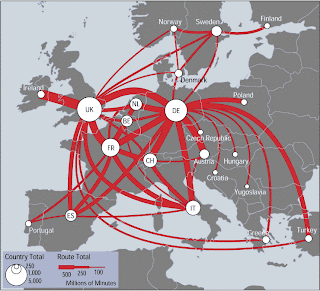
Flow maps are used to show the movement of something from one place to another. This can be anything like water, goods, people, etc.


http://www.mundi.net/maps/maps_014/
This map shows telephone traffic between the depicted countries. The thickness of each line is proportional to the yearly volume of traffic.
This is a map because it shows the relationship between the countries, and specifically the network of communication between the countries shown.