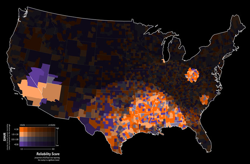
This map shows the standardized mortality ratio data by county of mortality rates due to cervical cancer. It has been filtered to show where the high risk clusters of the disease are located. (The brighter areas.)
http://www.geovista.psu.edu/grants/nci-esda/research.html
No comments:
Post a Comment